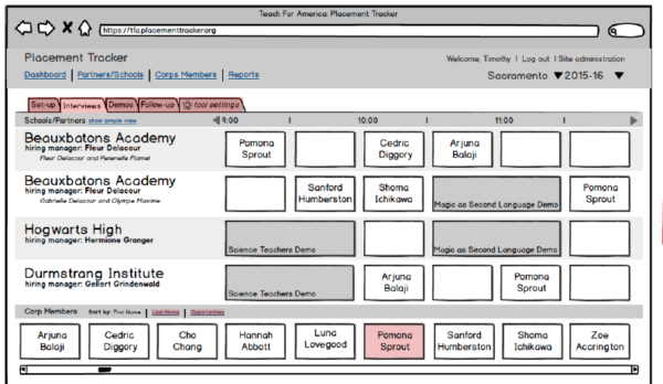
When Teach For America regions work with schools to place corps members into the job openings where they will teach in the fall, schools interview several corps members; corps members interview with several schools. One use described it as a bit like “job hunt speed dating.”
Hiring Managers’ and Corps Members’ are highly limited and therefore very valuable. TFA staff members would spend upwards of 40+ hours optimizing the experience manually. There were walls of post-it notes and lots of spreadsheets; additionally logging all of the interviews and job offers after the fact was time consuming and onerous.
My Role
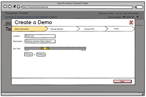
My team and I interviewed hiring managers and observed the hiring fairs they conduct themselves. In doing so, we identified some opportunities for efficiencies and automation, while still allowing them to feel in control of the day. We designed and tested wireframes, opting for early on lightweight low-fidelity prototype testing owing to the complexity of the code necessary for the final solution. By the time it went to development, we were sure we had the process right.
We continued to test and monitor the tool’s use over the course of interview season. The average time to setup these interview days was down to only a couple of hours per fair and compliance data entry was built into the tool’s execution requiring less than 5 minutes of additional time per interview day. The first year the tool was used, satisfaction by both hiring managers and corps members improved.
I did: Low fidelity wireframes, research
Let me tell you a story…
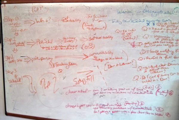
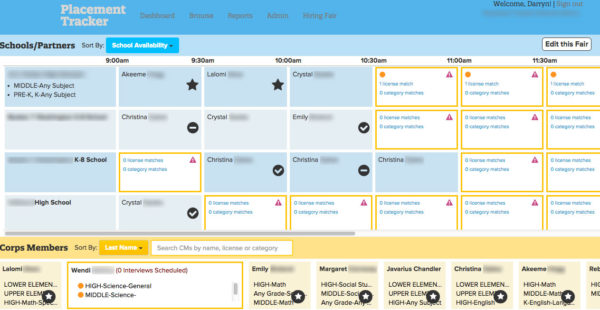
The initial concept called for a “drag and drop” interface; however, it became quite clear through early testing that errant drops on complex grids frustrated users. We tested a “double clicks” where a user clicks a name, activating it, and then the interface would go into a “placement mode” showing openings ranked by alignment. The user would then have to click again on the opening they wanted to place it in. The results were immediate: users preferred the two-clicks method. There were no errant placements, no sliding scrolls while dragging; although this app was designed only for desktop at the time, it had the advantage of also being more mobile ready. There was some concern among other team members who were counting clicks, but the user feedback spoke for itself: more was definitely better.
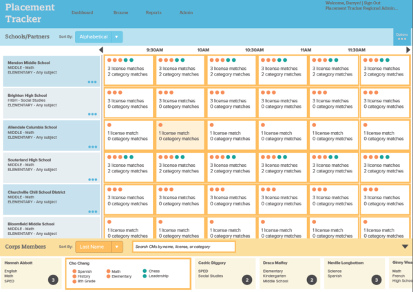
After successfully launching the Interview Matchmaker tool, we discovered another business team similarly had a complex, time-consuming many-to-many matchmaking problem. Using a lot of the foundational usability testing that informed the final design for this tool, we were able to quickly iterate and successfully design and launch a second match-making tool that similarly saw reductions in time to compliance and increases in data integrity.