Prospective Teach For America corps members must complete an online application as part of their first step to joining TFA. For the 2016–2017 Application season, this first step was radically reimagined with the experience of our applicants at the fore.
My Role
My team designed the new online application from the ground up. We collaborated closely with our in-house development team, and our business teams, all the while testing with prospects along the way.
My role: vision, low-fidelity wireframes and information architecture– with particular focus on timeline navigation and error handling.


Let me tell you a story…
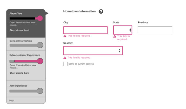
When a user sees a form, they make a quick gut hypothesis of how long it may take to fill out— and make a decision based on that. Perceived length is assessed via a quick glance: is it cognitively burdensome? Is it long? Applicants were observed scrolling from top to bottom, assessing the length of the form and how much was being asked of them.
We reduced the overall time it took to complete this step of the application process by nearly ⅔, greatly increasing the rate of users which completed the entire application. We focused the information that was visible on that initial scroll so that users didn’t react adversely to optional fields (which they didn’t know, because they were only skimming at first)— instead focusing only on what was required of everyone. It seemed shorter because it was shorter. And even users who had to enter a great deal of optional fields, still perceived it as overall being shorter and completed it more quickly.
You can read more about what Teach For America’s alumni magazine said about the changes we made (.pdf).