Client
A large international non-profit with U.S. based headquarters.
Role
UX Designer
Goal
At the time of design, GDPR was relatively new. There weren’t any good (i.e. upheld by legal precedent) examples we could build from.
The organization needed to respect the GDPR rights of its members by designing new flows for managing personal information and contact preferences.
Result
An early example that set the stage for how companies manage consent and PII. Laws like GDPR and CCPA are quickly becoming the rule, rather than the exception.
I designed and our engineering team built both internal and consumer-facing tools for members to manage their personal information.
The story…
The General Data Protection Regulation— GDPR for short— was a massive consumer data protection and privacy law passed by the European Union in 2016 and implemented in 2018. For any company who collected data on European Union citizens, this demanded major changes to business practice and any products where personal information appeared.
Consent is one of the key tenets of the GDPR law. The law defines it as “freely given, specific, informed and unambiguous indication […] by a statement or by a clear affirmative action.”
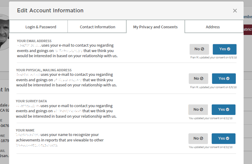
Users had to opt in to the uses of their information. Further, the law was interpreted that we couldn’t use design to make certain options more appealing, or use coercive design to steer a user to the choice we wanted them to take.
It was interpreted that using colors with strong imbued meanings like green and red were coercive— we had to choose and test novel colors. We added the icons to ease some of the cognitive dissonance these new colors presented in testing.

We created a new feature called “my privacy and consents.” The notion of Privacy was better understood by non E.U. members; whereas those familiar with GDPR jargon were clearer with the word consents. Because other staff were able to update consents (in limited contexts), we needed to be transparent with the user about who— and when— a consent was updated.
Designing for some of these new requirements required establishing new patterns that also needed to be built into the organization’s design system— as well as working with developers to ensure that there was clarity around when a “yes/no” option was consent and required an alternative design. After all, the use of red and green is so well established that removing it entirely would have adversely affected task completion and increased user error.
Consent wasn’t the only consideration— we additionally I designed the flows for the “Right to be forgotten,” changed how we presented our privacy policy, and further revamped our UX research program to be GDPR compliant and respectful of our E.U. members’ rights.

