Client
Fintech startup, specializing in digital banking for credit union and community banks.
The challenge
The team has launched the first version of its digital banking platform a couple years ago. However, it did not have a great market fit. Banks that adopted the platform were hit with negative reviews in the app store.
Overall, the app had usability issues. The sales team were frequently told the app looked “dated” and partner banks stated they were dealing with an aging membership.
The startup looked outside of itself for help in creating a research program with its design team. We were tasked with creating an app that could appeal to an age-diverse audience, while also feeling modern and usable.
My role
Researcher consultant, responsible for helping the team identify opportunities and methodologies for engaging with existing and potential customers.
I led the research and mentored the team in building skills in conducting their own studies.
I also helped the team design screens, flows, as well as testing them; using Figma.
Approach
- Interviews
- Moderated and unmoderated usability tests
- Impression testing
- Rapid prototyping and lean testing
- DesignOps (design systems and Zeplin)
- ResearchOps (Dovetail)
Competitive Advantage: Becoming an A11y
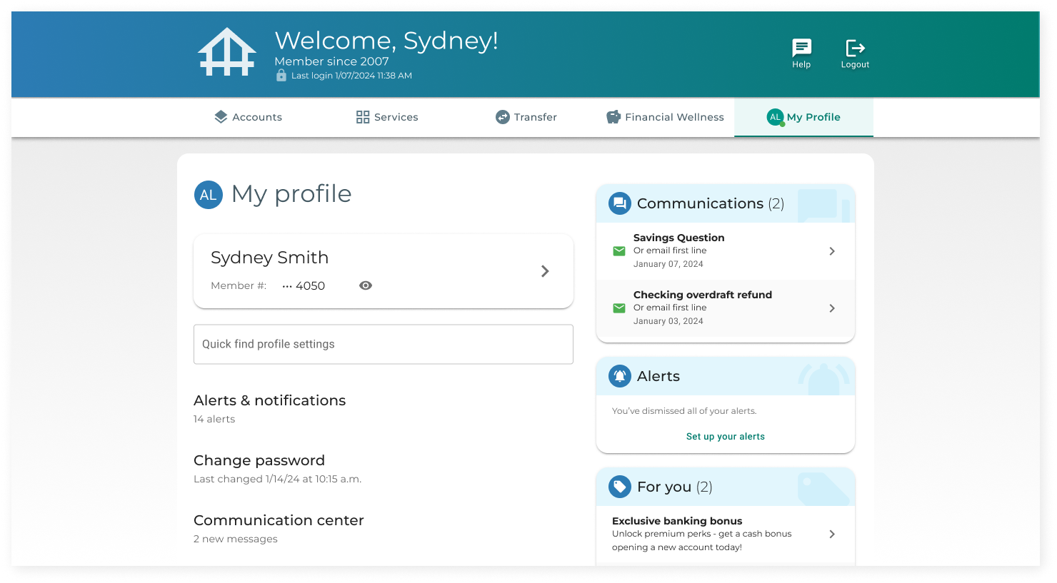
During the research, we talked to several younger users who used digital banking products. Contrary to the team’s initial hypothesis, their needs were not that different. Triggers that prompted them to “check their balance” were the most common reason they logged in. In other words, similar to the generally older user base.
However, one potential opportunity existed square in the middle of these two audiences. Younger users felt good about using products that displayed genuine awareness of various types of diversity, including neurodivergence. On the other side, meeting the needs of older audiences required attention to accessibility enhancements like font size, contrast, and touch area size.
Further, these enhancements would allow banks that used our digital banking product make accessibility a competitive advantage they offered to their members.
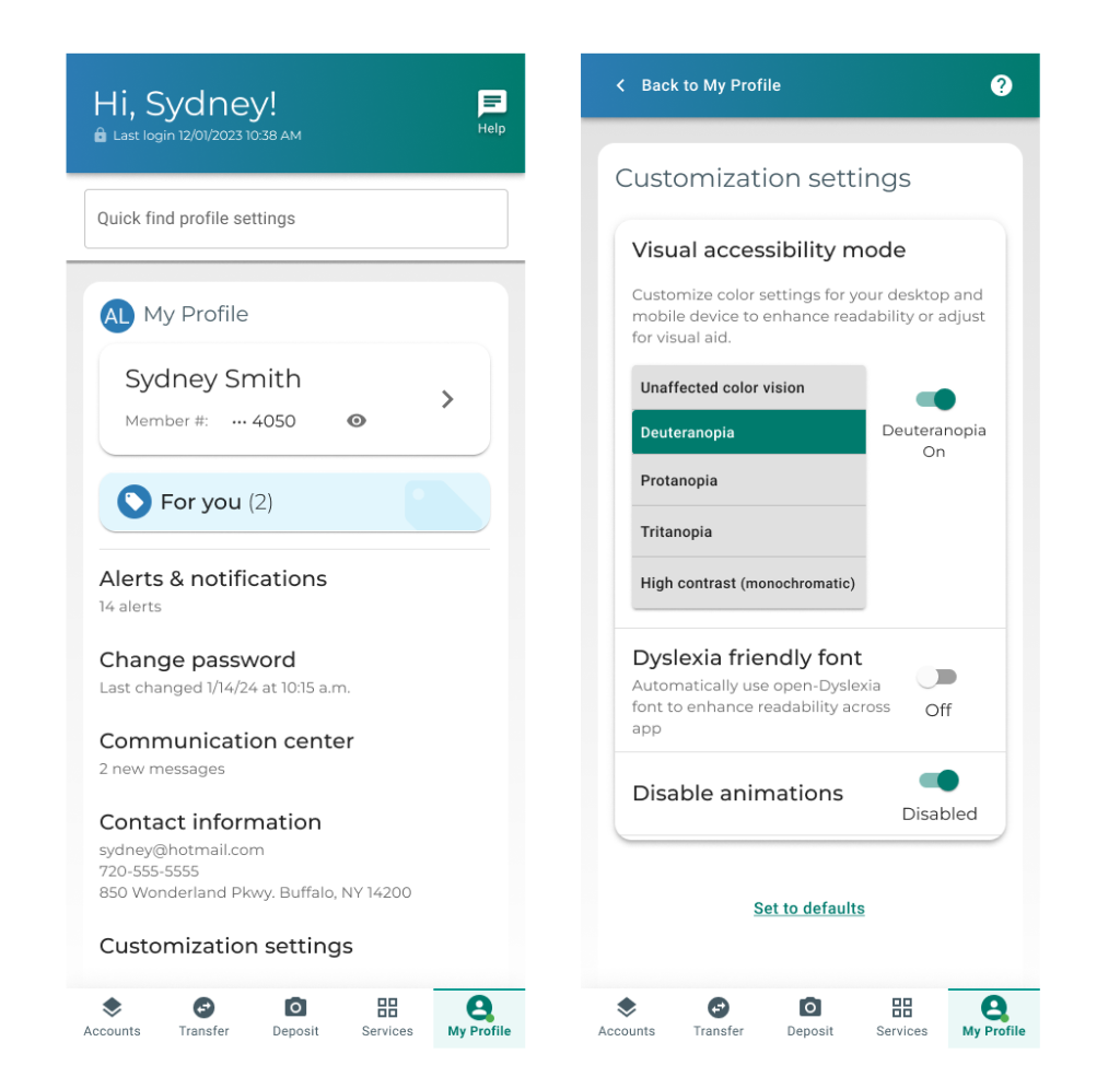
Much of the basic accessibility was baked into the core design— like the sizing of touch elements; however, we designed for other considerations as well. For example, the team used animations thoughtfully throughout the product. But we partnered with engineering to ensure that all were easily disabled from a customization menu. Alternate themes attuned to types of visual impairments, as well as a wholesale replacement of all type with the Dyslexie font, were among the settings were actively testing.
Research Operations: Sharing What We Learned
This startup was not small. There was a design team, a product team, an engineering team… a sales team! Customer support! Operations!
Talking to customers and users was not only going to help us improve the banking product, but it was also going to help the sales team— for example proactively identify objections, and be ready with answers (or even have data to show why things were designed a certain way).
Enter Dovetail. I chose this tool for two primary reasons.
First, it is a great place for the team to learn how to listen to interviews, code themes in interviews, and perform affinity mapping.
Second, it is helpful for sharing the results of the research throughout the organization.
We used Dovetail as the team conducted the research, but also as a tool for sharing findings and insights within the larger team.

What is Modern?
One of our core missives was to design an app that felt “modern.” But what is modern anyway?
We turned to “Five Second Testing,” or “Impression testing”, to quickly gather feedback from a large number of users on the direction of our designs.
Using a word bank of 20 words, including key hypotheses like “dated,” “modern,” “secure”, and others, we displayed one of our screens to a user for five seconds and then asked them to choose which words best describe what they saw. This methodology was inexpensive ($1 / user, through the testing platform we used) and allowed us to gauge the impression of hundreds of users in less than a day. It allowed us to iterate quickly.
There were some surprises: the presence of a gradient in the header was the single most predictive variable for a user perceiving a design as modern.

“I check my balance every day”
…but how many balances do you see?
In our competitive research we noticed that less than 10% of banks displayed more than one dollar amount per account.
However, our current version of the app displayed two balances. Given the importance of balance checking, we wanted to make sure we had it right. Secondly, if we were going to nudge the business on displaying two balances we needed a bit more data.
We setup a round of usability testing where we asked users to define “available balance” versus “current balance.”
Most users were confused by the terminology and were left uncertain about how much money they had in their account. We found that what most wanted to see was what was technically their “available” balance.
These details are important, and they’re still available when you go into an account. However, for the app’s landing page, the added cognitive weight of multiple balances was not worth it.
We went with just one showing – the available balance.
Added bonus? Future impression tests scored higher on “modern” and lower on “cluttered” after making the change. This was a double win.

The end results
The team had engaged the voices of over 500 new people across the studies we conducted and enabled sharing research easily across different disciplines at the company. At the time of press, the team was hard at work bringing the new version of their digital banking product to life.