Client
I started the GIN is IN in 2009 to evangelize gin— the spirit— to a wider audience.
It is the largest site devoted to gin, with nearly 1M unique visitors per year.
The Challenge
In my professional work consulting with distillers and writing for consumers, I observed a major disconnect between the technical aspects (what a distiller makes a product with) and what people perceived (how they talked about that flavor).
The challenge was to bridge the gap between the two.
My Role
Researcher and Designer. As the creator of this method, I also have published articles and given talks at industry conferences about my work.
Approach
- Qualitative and quantitative studies
- Visualization design
The story of Visualizing flavor in gin.
“I bought a bottle of gin. It didn’t taste like gin, so I poured it down the toilet […] I’m never buying American gin again!,” wrote one reader in response to a glowing write up of a gin which prominently featured the flavors of anise and licorice. The gin mentioned ingredients on the bottle which led the reader to expect something similar to another product; however, this gin utilized them differently. And tasted quite different.
This one anecdote helps illustrate how a user’s mental model of flavor contrasts with the actual flavor of the ingredients. Distilling is a transformative, chemical process. It’s not the same as cooking. Lavender can taste quite different based on how a distiller chooses to handle it; therefore, simply seeing the word “lavender” doesn’t communicate anything about flavor.
I conducted a survey of my readers to understand what influenced their decision to buy a new gin. Over 80% mentioned flavor as a consideration. Most respondents cited it as the primary factor.
The next step was interviewing and talking with non-professionals as they drank gin. Without anything other than the drink, they were asked to describe what they tasted. It became apparent through text analysis that the same words came up over and over. “It tastes a little piney.” “I’m getting a lot of floral notes.” “This gin is very hot.” Drinkers rarely, if ever were able to cite specific ingredients. They focused on the impression.
Bridging the gap
The goal was to provide a simple, short-hand way for understanding how a gin tasted. Further, since people shopped based on flavor, the goal was to help users who knew what gins they already liked, identify other gins with a similar flavor profile.
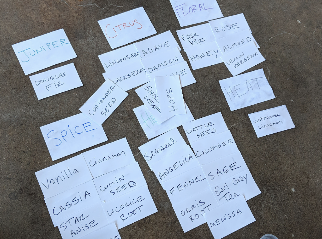
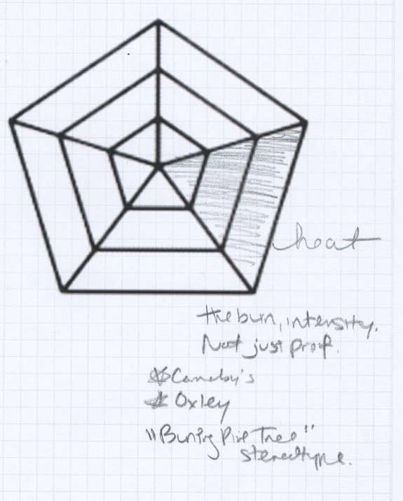
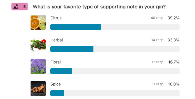
I worked from the baseline of the flavors people used. Five terms formed the foundation based on their frequency (a sixth one was added later as people’s vocabulary evolved). Initially, I had concepted visualizations with far more degrees of variance– like ten levels of flavor. However, it became clear after trying it out with people that the difference between a “6” and “7” wasn’t meaningful. There were too man level for people to roughly agree when talking to one another.
When asked why they assigned something a “6” or a “7” they would say things like “well there’s some citrus in here,” or “there was a lot of spice in here.” This was the second biggest insight in creating a visualization. If the goal was to communicate and your average customer could differentiate between a “little” and “a lot” (but not much more), the visualization should also echo that.
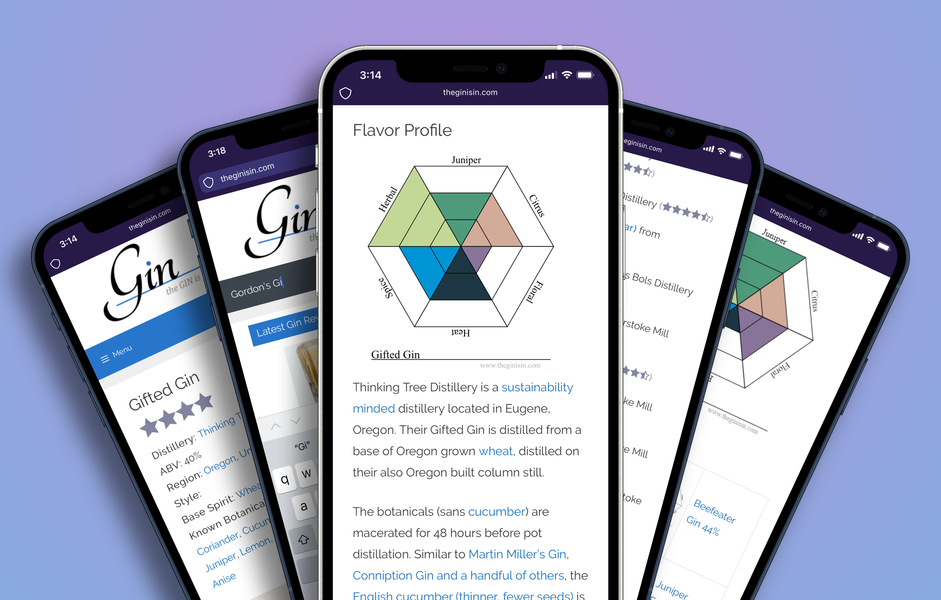
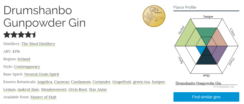
Instead of a complex bar chart, I sketched out a simple visual with only three levels. The visualizations I sketched to illustrate gins began to mirror the impressions people got from gin.
I launched the visualization on The GIN is IN. And later allowed users to search for gins based on flavor.
Learning from the diagram
The launch of the diagram was a success. It has led to sustained growth of the GIN is IN (growth of unique visitors went up nearly 100% in the first year after the diagram was launched). In the following months, I would consult with distillers in producing their products, and coach them how to communicate their work in a language that everyday consumers would understand. However, valuable the initial research on how people talked about gin was, it didn’t tell you anything about what people actually were looking for.
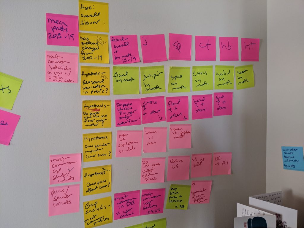
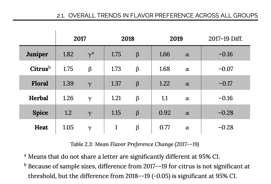
After a couple years of anonymously keeping track of what flavors users searched for, I looked at the data and realized that I could see patterns in what flavors users were looking for. Further, I could see that this was changing over time.
My work with distillers largely focused on smaller, “craft” distillers. These distillers often work alone or on small teams. Many test their products with friends or families before launching; an even smaller group might test with some everyday people from the community.
However, I’ve observed that these passionate creators rarely have access to the kind of data that large distilling companies have and use to make their decisions. My goal in sharing this data was to provide affordable, real, consumer behavioral data.
I published the first report in 2018 and have since released one every other year. The response has been positive. Distillers have shared positive feedback and several have used the data to design gin products that align with a market preference or market gap.
The end results
While the initial goal was merely to help bridge a gap I observed in consumer and producer language; the visualization led The GIN is IN to a new set of business opportunities that were not initially intended. By allowing people to search for products by flavor, in an accessible, familiar, fashion— patterns in that data emerged which helped distillers practice a bit of design thinking in the development of new products.
The next steps are to continue to monitor how people talk about gin. There’s some evidence that there may be “new” flavor descriptors emerging, especially as the level of consumer knowledge about gin increases. Further, interesting macro trends can be observed which yield insight into consumer behavior during other world events. During the first months of the pandemic of ’20-’21 searches increased to their highest levels ever observed. Consumers were searching for simple, single flavor gins, especially intense in citrus.