Case Study— Consent is Cool
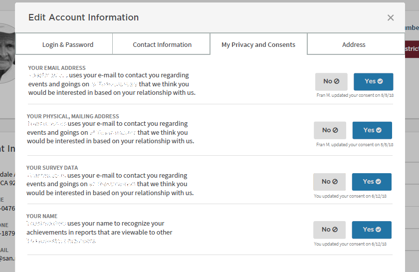
Consent is one of the key tenets of the GDPR law. The law defines it as “freely given, specific, informed and unambiguous indication […] by a statement or by a clear affirmative action.” It was interpreted by our legal team that using colors with strong imbued meanings like green and red were coercive— we had to choose and test novel colors. We added the icons to ease some of the cognitive dissonance these new colors presented in testing.
Case Study— Infographics and Visualizing Flavor
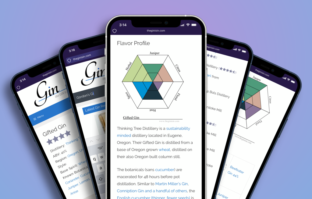
The most successful visualization I have designed is the flavor hexagon for communicating gin flavor. Users are able to search over 700 gin reviews on the GIN is IN by merely choosing what their ideal flavor diagram looks like (middle) and is then shown search results (right) of gins that matched their search.
Case Study— Cognitive Technologies and face-to-face interactions
One of the challenges in piloting was helping users imagine opportunities. This vision encapsulated speculative possibilities for several of the things we were researching individually.
Case Study— Consumer Taste Preference in Gin
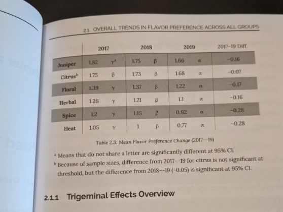
There is a dearth of affordable, accessible research for small gin brands just getting started. I study the trends in user flavor-based searches at the GIN is IN to help distillers better understand consumer desires and identify market gaps and opportunities.
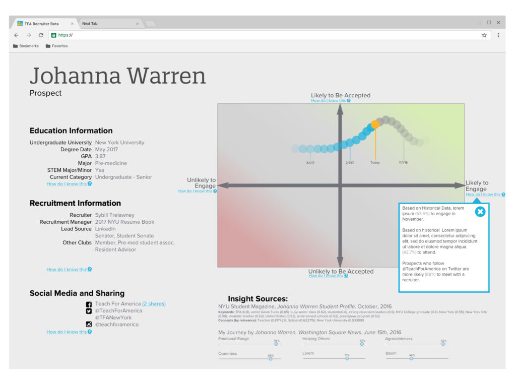
Case Study— Alumni Experience
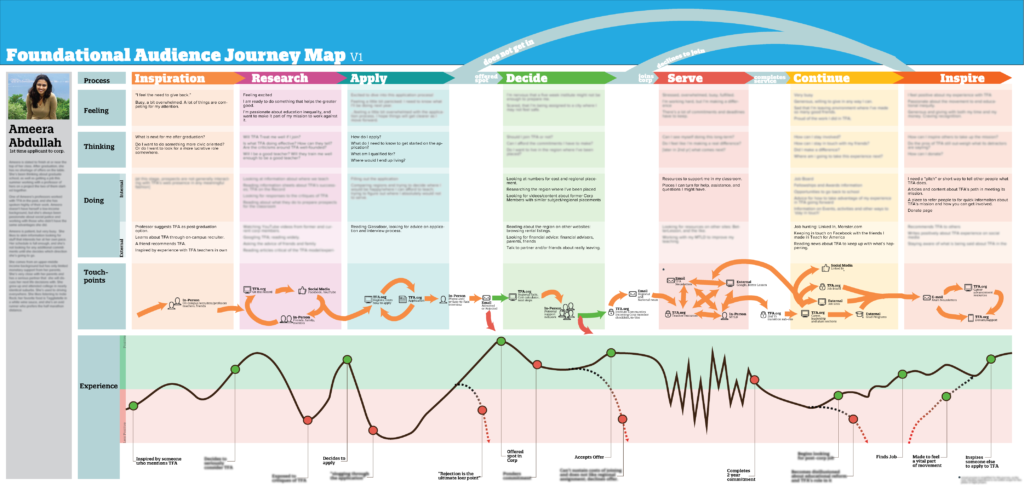
This Journey Map is made to represent research into the experience of a person who joins Teach For America: from the day they hear about TFA to their life after the corps.
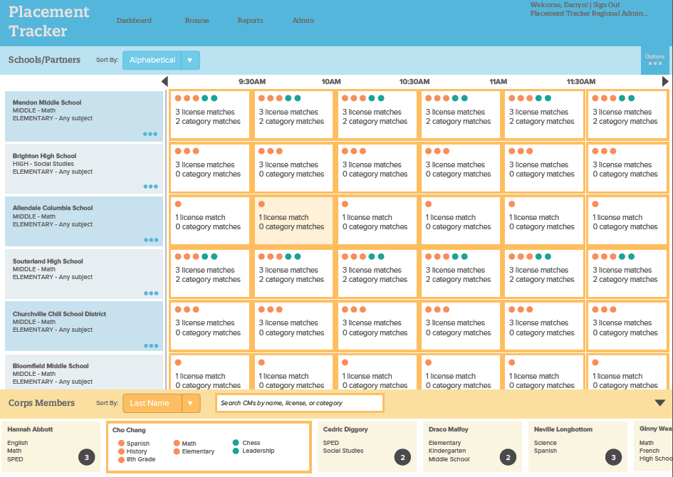
Case Study— Compliance Tracker
When coaches log in, this is the “person centered” view they see. All of their teachers’ faces are visible. For coaching managers, the filtering controls at left slide in and allow them to show/hide coaches, for example, to only see coaches at the school they’re travelling to today. This view was foundational in that it helped the users see data entry as a task that was about people more than compliance.
Case Study— RT Match
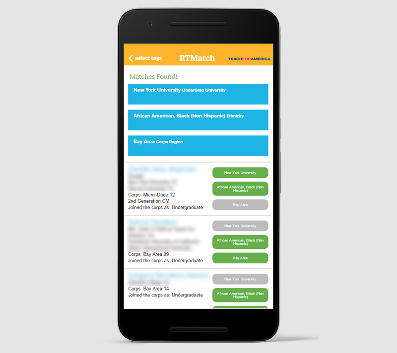
One of the most powerful ways recruiters helped students see the opportunity Teach For America presented them was to connect them with a person who had similar interests who served the corps. That data was always available in the office for recruiters, but not in the field when a recruiter met with a prospect. By providing the connection in the moment, it captured a prospect’s interest and reduced the risk of them cooling on the idea before a connection was made.
Case Study— Customization and Autonomy
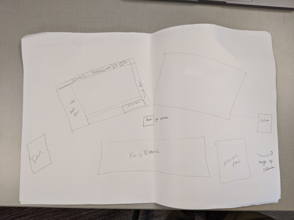
Once on the ground performing the work, service staff would develop their own highly personalized and sometimes eccentric ways to get the job done. Between training and mastery, a user would bend the software and physical space setup to their mental models. It was clear that a rigid software approach wasn’t going to get the job done. To bring these insights from the field back and to help product team staff better empathize with our users, I created and executed a sketch study.
Case Study— Interview Matchmaker
Not all matches are created equal; not all interviewees were a good match for an interview opportunity. In this version, the colors and circles were added to help a user quickly compare and identify optimal opportunities for candidates, to ensure that the matchmakers were putting the right people in front of the right people. This concept evolved through focus groups and further study.
Case Study—Application
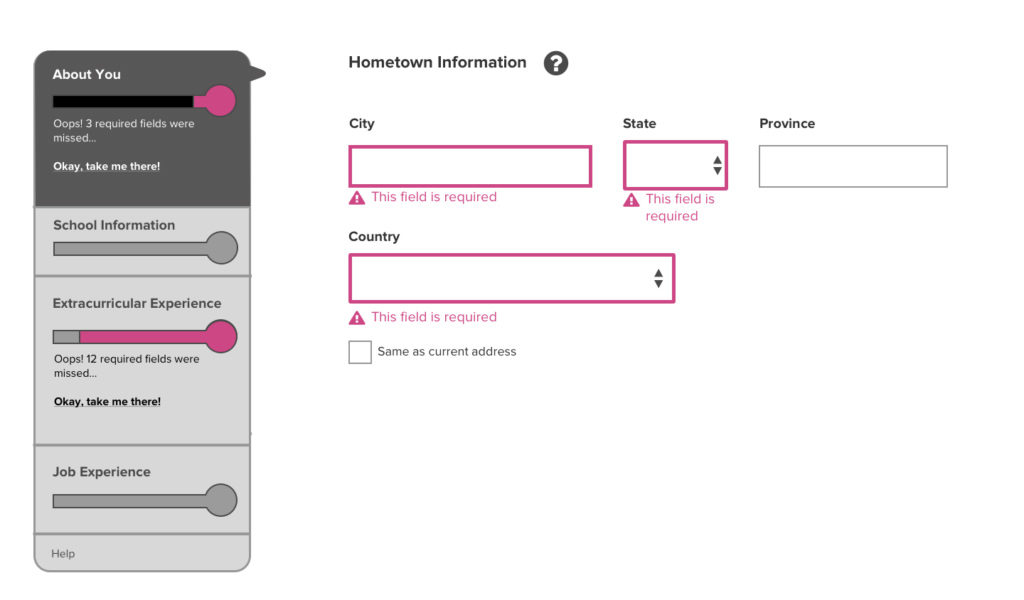
Designing a responsive application, with subtle nudges and improved navigability helped stem a four year decline in applications.